The property grid on the left side of the application is the main way to modify framework and device behaviour. Properties displayed in light grey are read-only and cannot be modified by the user. Only the properties, which actually have an impact on the resulting image right now, will be visible. Therefore, certain properties might appear or disappear when modifying another properties.
- Note
- If the property grid is not visible it can be enabled using the appropriate button within the left toolbar: ImpactControlCenter - Enabling the property grid
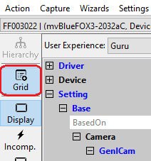
If the left toolbar also is not visible the Options will allow to enable it.
The values of properties currently set to their default values will be displayed in a normal green font to indicate that these values have not been modified by the user so far. Modified properties (even if the value is the same as the default) will be displayed in a bold green font. It is possible that properties do already appear as being modified directly after opening a Impact Acquire instance to it. In that case a previously stored setting has be found and loaded. See Storing, Restoring And Managing Settings for details.
User Experience
In the upper section of the property grid the "User Experience" can be selected. According to the chosen experience, the level of visibility is different:
- Beginner (basic camera settings/properties are visible)
- Expert (e.g. all advanced image processing are visible)
- Guru (all settings/properties are visible)
Find A Feature
Once a device has been opened and maybe after switching the User Experience to "Guru" there can easily be 500+ features into the feature tree of a single device instance. When not quite sure where to look the "Find Feature" option might come in handy:
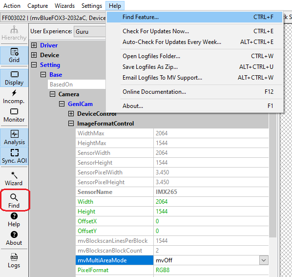
This will open a flat list of all features currently available (even those currently invisible). While typing along the list is reduced to the features containing what has been typed so far.
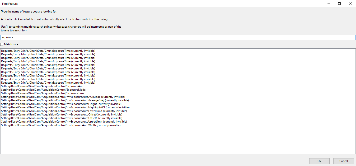
Once the feature has been found a double-click on that feature will close the find dialog again an will expand the feature tree accordingly and will select the feature the user was looking for.
Detailed Feature Information
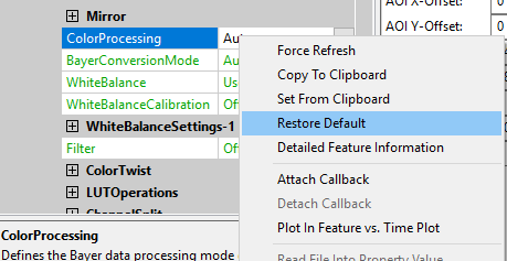
Right-clicking on a feature in the property grid will allow (among other things) to display the "Detailed Feature Information", displaying all sorts of information about a certain feature in a separate dialog:
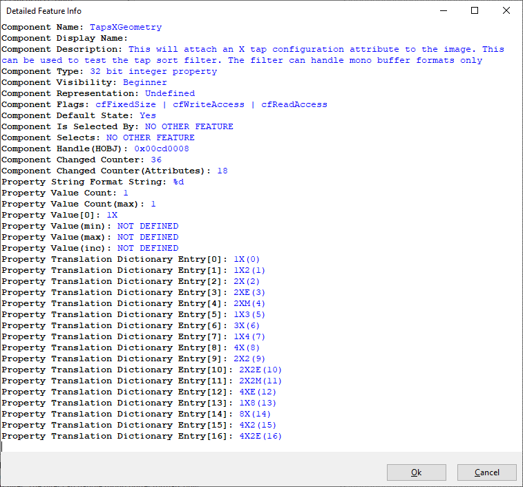
For additional information about what all these data means please refer to the documentation of the objects derived from the Component class in the API manual of the programming language of your choice. Online versions of all these documents can be found here: https://www.balluff.com/en-de/online-manuals-mv
Properties
To modify the value of a property select the edit control right of the properties name. Property values, which refer to the default value of the device, are displayed in green. A property value once modified by the user will be displayed in black (even if the value itself has not changed). To restore its default value of a single property
- right click on the name of the property and
- select "Restore Default".
To restore the default value for a complete list (which might include sub-lists)
- right click on the name of a list and
- select "Restore Default".
In this case a popup window will be opened and you have to confirm again.
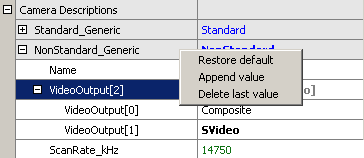
Most properties store one value only, thus they will appear as a single entry in the property grid. However, properties are capable of storing more than one value, if this is desired. A property storing more than one value will appear as a parent list item with a WHITE background color (lists will be displayed with a grey background) and as many child elements as values stored by the property. The parent grid control will display the number of values stored by the property, every child element will display its corresponding value index.
If supported by the property, the user might increase or decrease the number of values stored by right-clicking on the parent grid element. If the property allows the modification the pop up menu will contain additional entries now:
When a new value has been created it will be displayed as a new child item of the parent grid item:
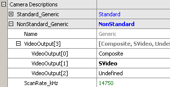
Currently, only the last value can be removed via the GUI and a value can't be removed, when a property stores one value only.
Also the user might want to set all (or a certain range of) values for properties that store multiple values with a single operation. If supported by the property, this can also be achieved by right-clicking on the parent grid element. If the property allows this modification the pop up menu will again contain additional entries:
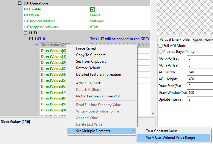
It's possible to either set all (or a range of) elements of the property to a certain value OR to define a value range, that then will be applied to the range of property elements selected by the user. The following example will explain how this works:
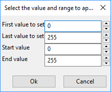
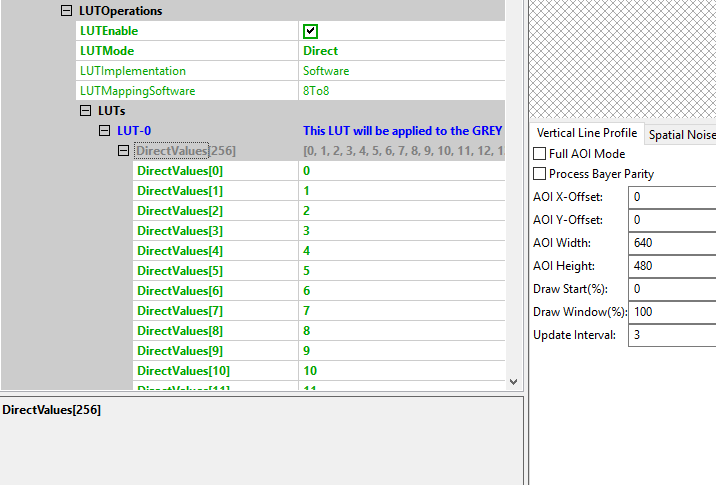
In this sample the entries 0 to 255 of the property will be assigned the value range of 0 to 255. This will result in the following values AFTER applying the values:
Properties containing binary data will offer 2 additional options:
- "Read File Into Property Value"
- "Write Property Value To File"
Both might come in handy at some time. They allow to directly exchange the value of a property containing binary data with the hard disk.
Methods
Methods appear as entries in the tree control as well. However, their name and behavior differs significantly from the behavior of properties. The names of method objects will appear in 'C' syntax like e.g. "int function( char*, int )". This will specify a function returning an integer value and expecting a string and an integer as input parameters. To execute a method object either click on the little button with the 3 dots right of the methods parameter list or
- right click on the name of a method and
- select "Execute" from the popup menu:
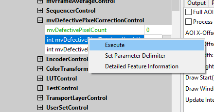
Parameters can be passed to methods by selecting the edit control left of a method object. Separate the parameters by blanks. So to call a function expecting a string and an integer value you e.g. might enter "testString 0" into the edit control left of the method.
The return value (in almost every case an error code as an integer) will be displayed in the lower right corner of the tree control. The values displayed here directly correspond the error codes defined in the interface reference and therefore will be of type TDMR_ERROR or TPROPHANDLING_ERROR.
It is possible to execute methods either synchronously or asynchronously. This can be configured by using the Options dialog and is explained in the section Synchronous Method Execution.
Standard View and Developers View
With ImpactControlCenter it is possible to switch the views between "Standard View" (user-friendly) and "Developers View". While the first (default) view will display the device access libraries feature tree in a way that might be suitable for most users of a GUI application it might present the features in a slightly different order as they actually are implemented in the device access library. The developers view switches the tree layout of the application to reflect the feature tree exactly like it is implemented an presented by the SDK. It can be helpful when writing code that shall locate a certain property in the feature tree of the device access library using the C, C++, Java, .NET or Python interface. The feature hierarchy displayed here can directly be used for searching for the features using the "ComponentLocator (C++/.NET)" objects or "DMR_FindList (C)" and "OBJ_GetHandleEx (C)" functions.

Callbacks
The property grid offers a way to get informed when properties change. This can be done by right-clicking on the desired feature and then select "Attach Callback" from the context menu. This can be done for as many features as desired.
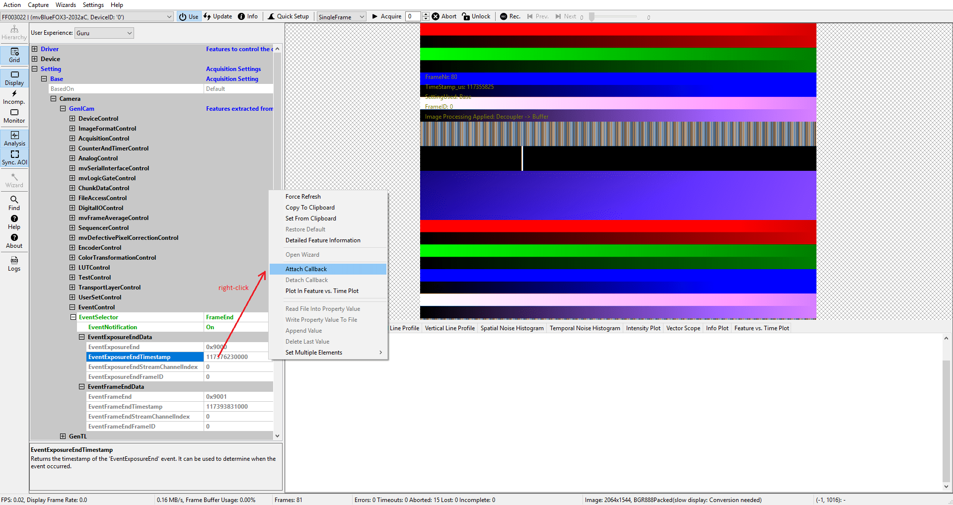
Now whenever one of these features change in any way (this includes not only a properties value but also e.g. it's visibility or access mode) a message will be written to the "Output" tab of the lower right analysis controls:

To detach/remove the callback again just right-click on the feature again and select "Detach Callback". This option will only be available if a callback is currently attached to the feature.
